
Make TYPO3 websites responsive
A clear setup: The TYPO3 website is already getting a bit old and slowly more and more alerts from Google come in, that it can come to penalties in the search results, if nothing is done here. So what is to be done? Is there possibly a TYPO3 extension that can remedy this or is the implementation really all manual? Where is the difference to the various TYPO3 versions and template engines when designing a responsive website? We want to face up to these challenges and solve problems and make a transparent presentation on which screw you should turn and where and how much effort can be made.
Basically: What does Responsive Design actually mean with TYPO3 or other content management systems?
Responsive design fits in contrast to the s.g. Adaptive design flexible (ie - more or less - liquid) to the size of the browser window. The website is based on i.d.R. at the viewport of the window, after which "Breakpoints" are defined for breaking the contents. A commonly used framework for this is, for example, Bootstrap, on whose example we will orient ourselves.
Using defined widths, the different device classes are intercepted and the web page elements displayed accordingly optimized. The example in the screenshot says, among other things, that all device classes up to a maximum width (max-width) of 575.98 px should be addressed. Instead of the green dots, rules must now be introduced that define the behavior of the containers and content items.
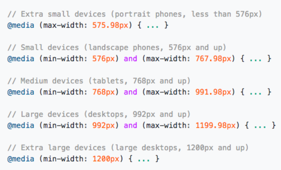
Source: https://getbootstrap.com/docs/4.1/layout/overview/
Example: A three-column layout should be displayed on mobile devices as a single-column layout, so that the usability of the page is optimized and the texts are not too small. For this one defines a (CSS) rule which states that the three-column container should get a width of 100% at less than 575.98 px in order to draw the contents to the full width. This happens element by element, width by width, until the web page shows the desired behavior. To this end, a UX concept should be defined in advance, based on which detailed information about the web page elements have emerged.
Google and the mobile world of the Search Console
The mobile update, which has been largely announced by Google since April 21, 2015, has finally ushered in the age of mobile optimization for websites. Rolled out by the term "Mobilegeddon" for some, the update has created a true battlefield in mobile search, opening up many opportunities for market participants, but also posing major challenges for agencies and website operators; provided that the websites have not yet been subjected to mobile optimization. The Search Console does not only give warnings, but also helps under the point: Search queries -> user friendliness on mobile devices. Here, the pages with problems appear in detail and display warnings such as "clickable elements are too close together" or "content wider than screen", which should be taken care of in order to continue to please Google mobile and to benefit from it in the search engine.
Responsive TYPO3 extensions - Is there anything like it?
The short answer is no. More broadly, TYPO3 is an enterprise content management system. In TYPO3, there are many starter packages compared to WordPress, but few finished templates that are installed with just a few clicks. This makes TYPO3 very flexible, but also more time-consuming when designing websites.
At first theres usually only a HTML template, which then has to be integrated or translated into the appropriate template engine, so that TYPO3 can display the dynamic content entered via the backend in the appropriate places. So, if the template was not designed for responsive use right from the start, it is important to analyze and adjust each element as described above.
Jede mit TYPO3 erstellte Webseite ist somit einzigartig, weswegen es keine pauschale Extension gibt und mit großer Wahrscheinlichkeit auch niemals geben wird.
Responsive design in TYPO3 v4.x - 9.x. Where are the differences
Like any good software, TYPO3 has evolved over the years. A very popular extension for template management and initialization under TYPO3 v4.x was "Templa-Voila!" among others. Later, you worked with markers under version 6.x and since TYPO3 v7.x "fluid" is used as the engine in most projects. For every upgrade from one TYPO3 version to the next, the templates normally have to be rewritten.
The regular term of TYPO3 v4.x was 2015 from the first release in 2006 until the end of Long Term Support (LTS). Since around 2013, the shift towards Responsive Design has begun. Therefore, many websites in this TYPO3 version were not designed for viewing on mobile devices, which led to challenges in upgrading to the next version (TYPO3 v6.x).
Which means not only TYPO3 developed, but the whole Internet continued to develop.
Checklist for TYPO3 responsive design
In order to be able to estimate costs for the revision of the TYPO3 website, you can get a rough overview in advance by answering the following questions:
- Which TYPO3 version is running on the server?
- Which template engine is in use? (for example.: TemplaVoila!, Fluid, Flow)
- Is repsonive design sufficient or is it worth to relaunch (Are the contents still suitanle for the company?)
- How many different templates does my page have? (homepage, subpage, landingpages, blog, etc.)
- Which elements need to be adapted? (menu, slider, accordions, buttons, fonts, etc.)
In conclusion
Since TYPO3 web pages are individually designed tools for creating, displaying and distributing content on the Internet, no template is the same as the other. A button in the backend that tells a webpage that it should now be rendered optimized for mobile devices does not exist. Just as little as an extension that creates a responsive layout from a non-optimized template. Every project is as individual as your business and therefore needs to be analyzed in detail. Expenses arise in the conception, programming of the (new) template and the integration in the corresponding template engine in TYPO3. Depending on the complexity of the structure and the number of different templates, the cost of switching to a responsive TYPO3 website varies. The effort can be between a few days and several months. Often a relaunch of the site is worthwhile to create further added value, as content and claims of the operator change over time.
Contact us
Office Wiesbaden
Mainzer Straße 75
65189 Wiesbaden